Graphing examples
This notebook contains some examples of how to generate isotherm graphs in pyGAPS. In general, we use matplotlib as a backend, and all resulting graphs can be customized as standard matplotlib figures/axes. However, some implicit formatting is applied and some utilities are provided to make it quicker to plot.
Import isotherms
First import the example data by running the import notebook
[1]:
%matplotlib inline
%run import.ipynb
import matplotlib.pyplot as plt
Selected 5 isotherms with nitrogen at 77K
Selected 2 room temperature calorimetry isotherms
Selected 2 isotherms for IAST calculation
Selected 3 isotherms for isosteric enthalpy calculation
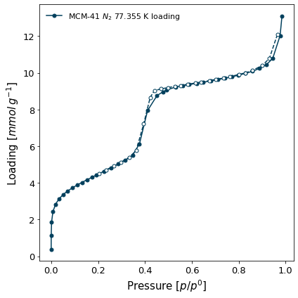
Isotherm display
To generate a quick plot of an isotherm, call the plot() function. The parameters to this function are the same as pygaps.plot_iso.
[2]:
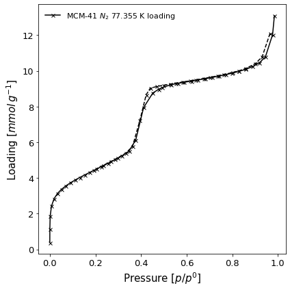
isotherm = next(i for i in isotherms_n2_77k if i.material=='MCM-41')
ax = isotherm.plot()
Isotherm plotting and comparison
For more complex plots of multiple isotherms, the pygaps.plot_iso function is provided. Several examples of isotherm plotting are presented here:
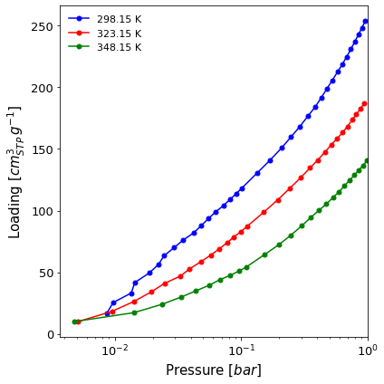
A logarithmic isotherm graph comparing the adsorption branch of two isotherms up to 1 bar (
x_range=(None, 1)). The isotherms are measured on the same material and batch, but at different temperatures, so we want this information to be visible in the legend (lgd_keys=[...]). We also want the loading to be displayed in cm3 STP (loading_unit="cm3(STP)") and to select the colours manually (color=[...]).
[3]:
import pygaps.graphing as pgg

ax = pgg.plot_iso(
    isotherms_isosteric,
    branch = 'ads',
    logx = True,
    x_range=(None,1),
    lgd_keys=['temperature'],
    loading_unit='cm3(STP)',
    color=['b', 'r', 'g']
)
A black and white (
color=False) full scale graph of both adsorption and desorption branches of an isotherm (branch = 'all'), saving it to the local directory for a publication (save_path=path). The result file is found here. We also display the isotherm points using X markers (marker=['x']) and set the figure title (fig_title='Novel Behaviour').
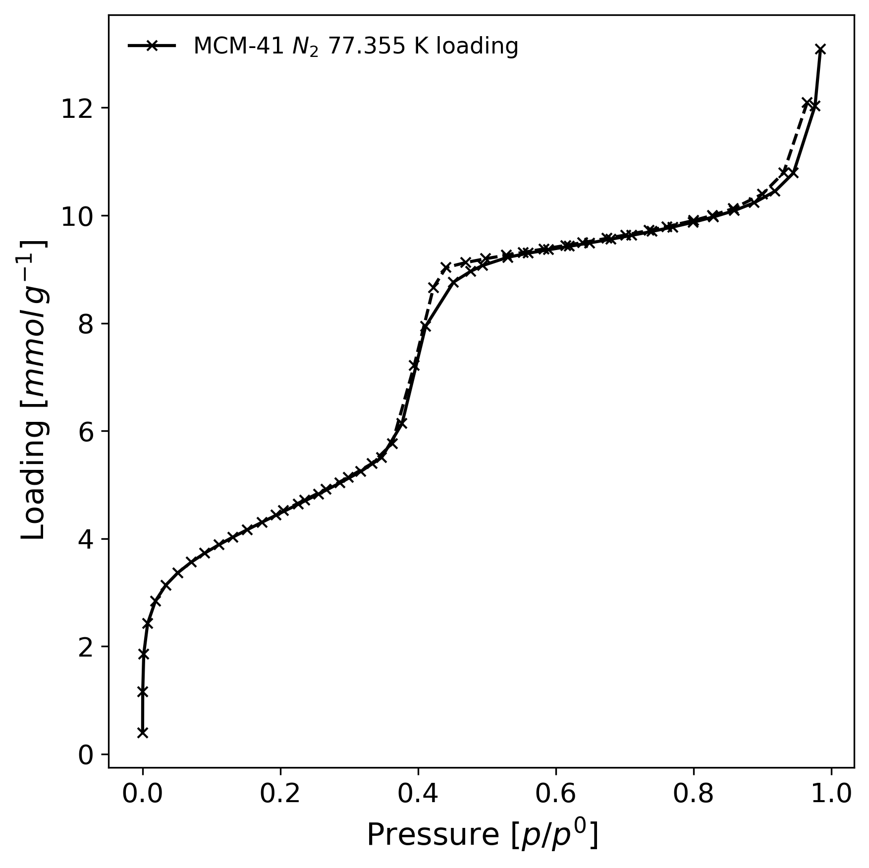
[4]:
import pygaps.graphing as pgg
from pathlib import Path

path = Path.cwd() / 'novel.png'

isotherm = next(i for i in isotherms_n2_77k if i.material=='MCM-41')

ax = pgg.plot_iso(
    isotherm,
    branch = 'all',
    color=False,
    save_path=path,
    marker=['x'],
)
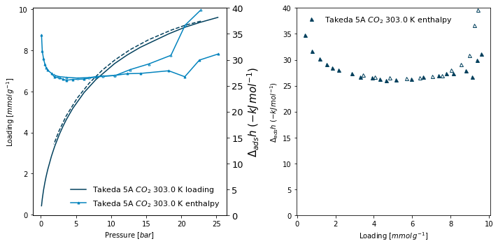
A graph which plots the both the loading and enthalpy as a function of pressure on the left and the enthalpy as a function of loading on the right, for a microcalorimetry experiment. To do this, we separately generate the axes and pass them in to the
plot_isofunction (ax=ax1). We want the legend to appear inside the graph (lgd_pos='inner') and, to limit the range of enthalpy displayed to 40 kJ (eithery2_rangeory1_range, depending on where it is displayed). Finally, we want to manually control the size of the pressure and enthalpy markers (y1_line_style=dict(markersize=0)).
[5]:
fig, (ax1, ax2) = plt.subplots(1, 2, figsize=(10,5))

pgg.plot_iso(
    isotherms_calorimetry[1],
    ax=ax1,
    x_data='pressure',
    y1_data='loading',
    y2_data='enthalpy',
    lgd_pos='lower right',
    y2_range=(0,40),
    y1_line_style=dict(markersize=0),
    y2_line_style=dict(markersize=3),
)
pgg.plot_iso(
    isotherms_calorimetry[1],
    ax=ax2,
    x_data='loading',
    y1_data='enthalpy',
    y1_range=(0,40),
    lgd_pos='best',
    marker=['^'],
    y1_line_style=dict(linewidth=0)
)
<AxesSubplot:xlabel='Loading [$mmol\\/g^{-1}$]', ylabel='$\\Delta_{ads}h$ $(-kJ\\/mol^{-1})$'>
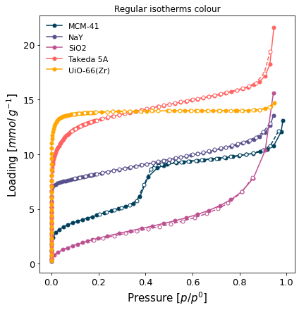
A comparison graph of all the nitrogen isotherms, with both branches shown but without adding the desorption branch to the label (
branch='all-nol'). We want each isotherm to use a different marker (marker=len(isotherms)) and to not display the desorption branch component of the legend (onlylgd_keys=['material']).
[6]:
ax = pgg.plot_iso(
    isotherms_n2_77k,
    branch='all',
    lgd_keys=['material'],
    marker=len(isotherms_n2_77k)
)
ax.set_title("Regular isotherms colour")
Text(0.5, 1.0, 'Regular isotherms colour')
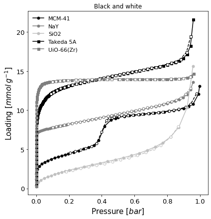
A black and white version of the same graph (
color=False), but with absolute pressure in bar.
[7]:
ax = pgg.plot_iso(
    isotherms_n2_77k,
    branch='all',
    color=False,
    lgd_keys=['material'],
    pressure_mode='absolute',
    pressure_unit='bar',
   )
ax.set_title("Black and white")
Text(0.5, 1.0, 'Black and white')
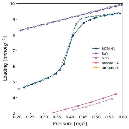
Only some ranges selected for display from all the isotherms (
x_range=(0.2, 0.6)andy1_range=(3, 10)).
[8]:
ax = pgg.plot_iso(
    isotherms_n2_77k,
    branch='all',
    x_range=(0.2, 0.6),
    y1_range=(3, 10),
    lgd_keys=['material']
)
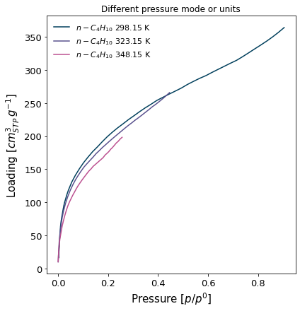
The isosteric pressure isotherms, in relative pressure mode and loading in cm3(STP). No markers are displayed (
marker=False).
[9]:
ax = pgg.plot_iso(
    isotherms_isosteric,
    branch='ads',
    pressure_mode='relative',
    loading_unit='cm3(STP)',
    lgd_keys=['adsorbate', 'temperature'],
    marker=False
)
ax.set_title("Different pressure mode or units")
Text(0.5, 1.0, 'Different pressure mode or units')
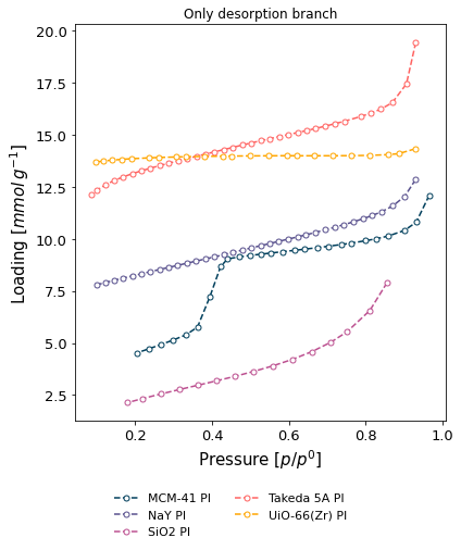
Only desorption branch of some isotherms (
branch='des'), displaying the user who recorded the isotherms in the graph legend.
[10]:
ax = pgg.plot_iso(
    isotherms_n2_77k,
    branch='des',
    lgd_keys=['material', 'user'],
    lgd_pos='out bottom',
)
ax.set_title("Only desorption branch")
Text(0.5, 1.0, 'Only desorption branch')